
Phishing Editor Block Reference
Important: This guide is intended for creating simulated phishing campaigns for training purposes only. Unauthorised phishing attempts are illegal and unethical. Please do not use personal information, personal images, or real logos in any of your campaigns.
Phishing Email Editor
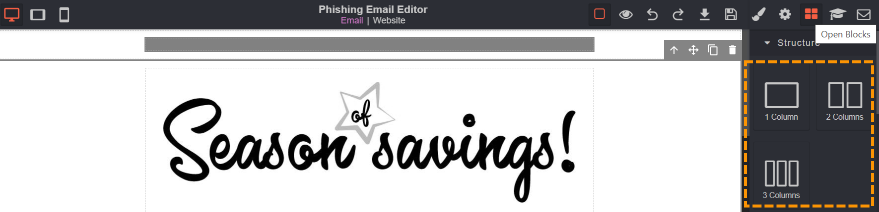
Column
A column helps to give the page structure and it allows you to arrange other blocks into the columns.
Please note that without a column you won't be able to add buttons, dividers, images and even text.
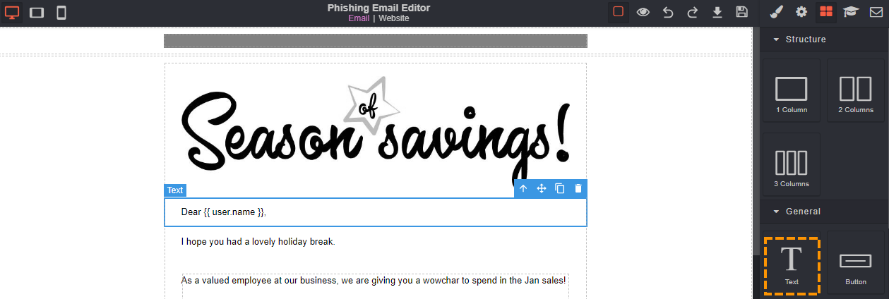
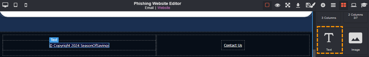
Text
The text block can be used to add written words to make the phishing email or website more believable.
The text element can used as many times as you would like throughout the email or website.
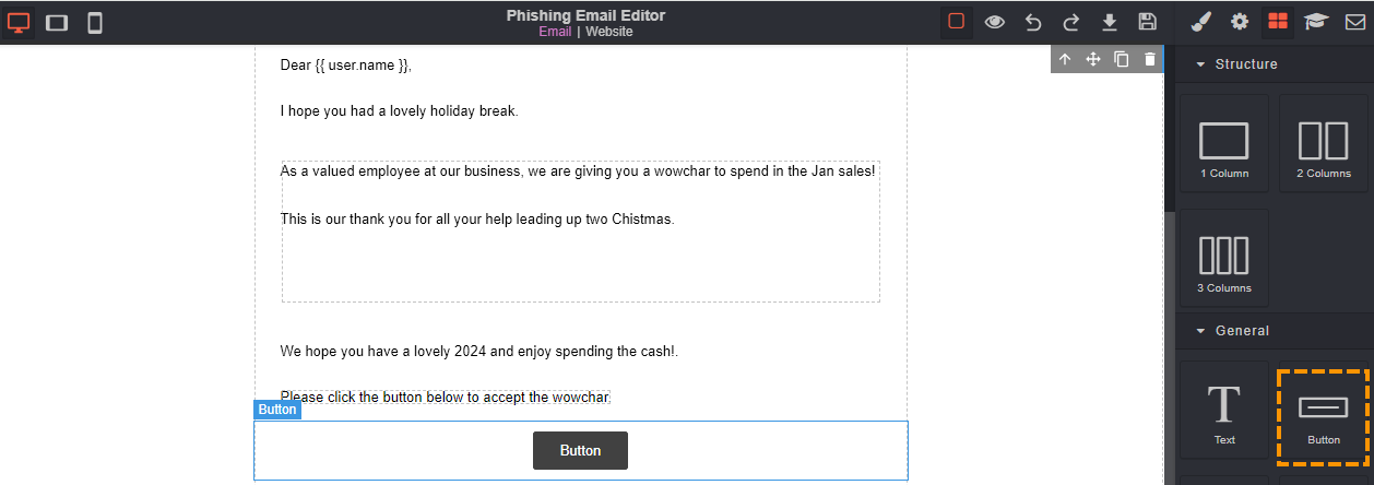
Button
A button can be used to create a user-friendly way of getting a user to interact with the email or website. It can be used to get the user to "submit" their personal details, or to "download" a software update.
If a button is used in an email then the button will take the user to the website.
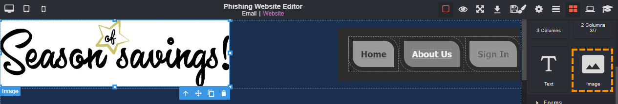
Image
Images can be used to create realism, mimic social engineering techniques and to capture the users interest.
An image can be used in both the email and website editor. The image can be in any format (PNG or JPEG) however, they must be below 2MB in size and have fewer than 2 million pixels.
Please note that we do not allow the use of personal images or logos that represent a real company.
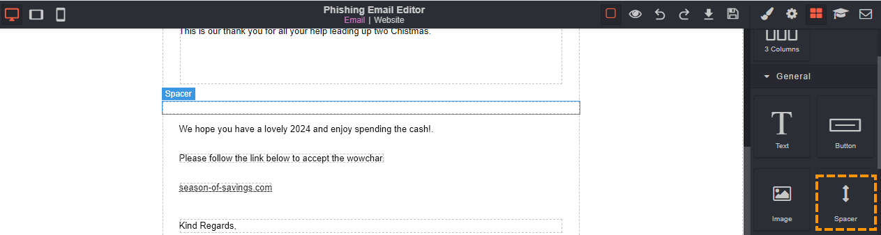
Spacer
A spacer is used in the email to create space, distance or separation between other elements in the email.
Spacers help with the alignment, aesthetics, accessibility and user experience of the website.
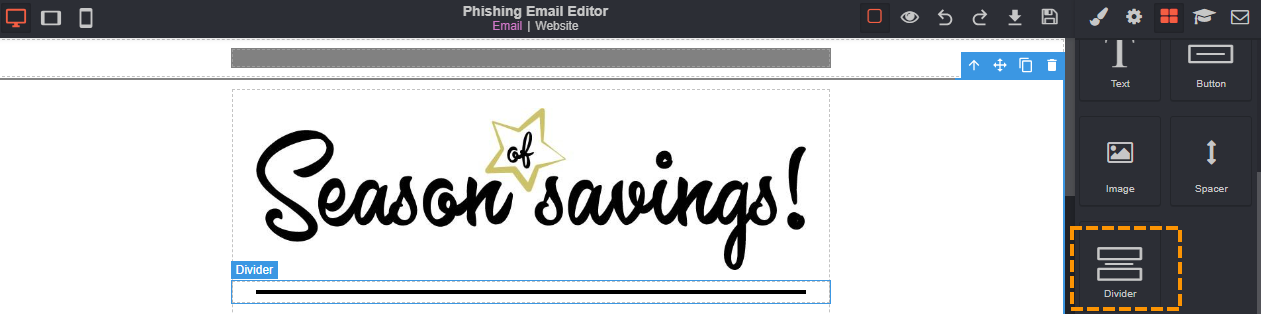
Divider
The divider icon can be used to create a clear separation between the columns or images. The divider will appear as a vertical line.
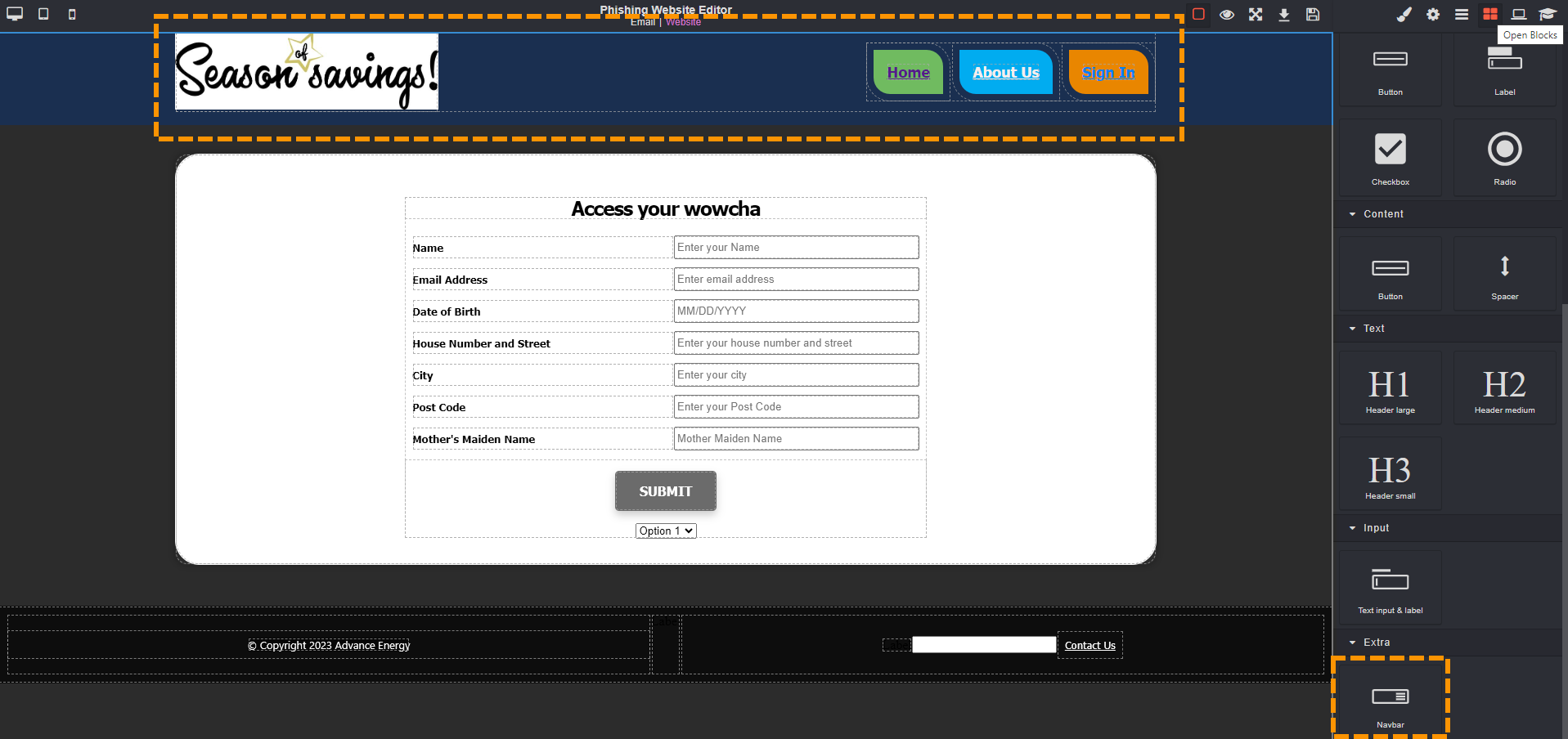
NavBar
A NavBar which is short for navigation bar can be used to create a way for users to interact with the website.
The NavBar typically appears at the top of the webpage and it can contain links or buttons that if a user interacts with they would automatically be taken to the training page.
A NavBar is an important part of a websites user interface as it enables them to quickly access different parts of the site. In this case, any user interaction on the webpage triggers the training page.
The Navbar may also include a logo of a fictional company to reinforce the identity of the site. Please do not use a real logo or company.
NavBar Link
The NavBar link can be used to add additional links into the NavBar.
Please not that the NavBar link can't be used unless the NavBar element is already present.
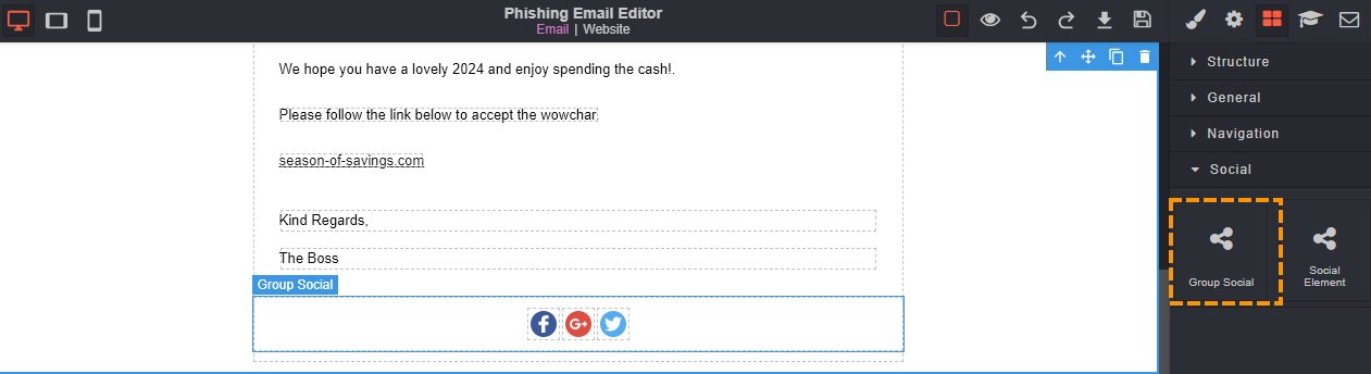
Group Social
The group social icon can be used to add multiple social elements to your email. The social elements that are added are for "Facebook", "Google+" and "Twitter".
Using the group social element can help to create a realistic impression of a genuine email. If a user was to click on any of the social elements will not take the user to the webpage or training page.
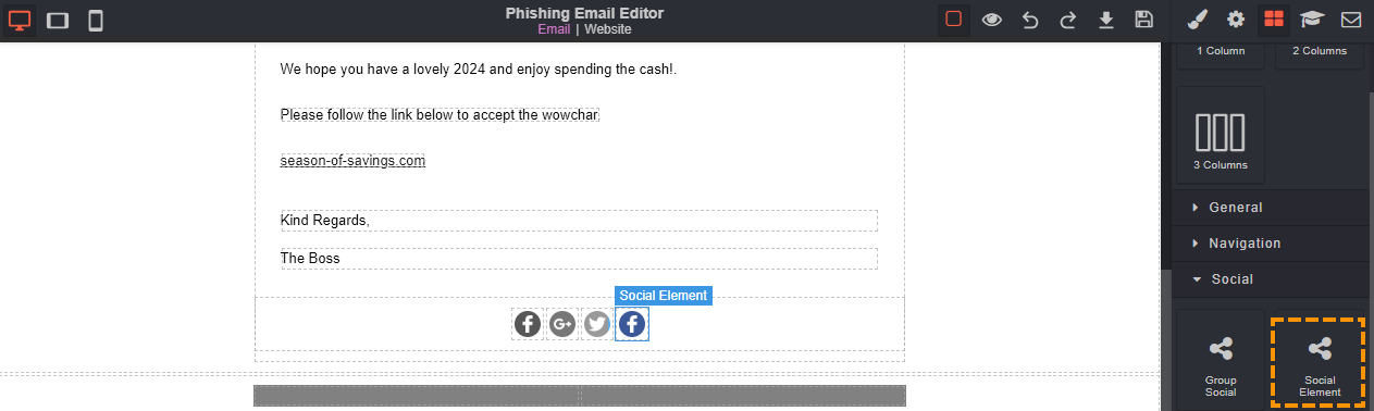
Social Element
The social element icon can be used to add an additional social element. The social element that is added is the "Facebook" element.
This can be useful if you only wanted to add multiple social elements. If a user was to click on the social element will not take the user to the webpage or training page.
Please note that the social element icon can only be used if the group element is present.
Phishing Website Editor
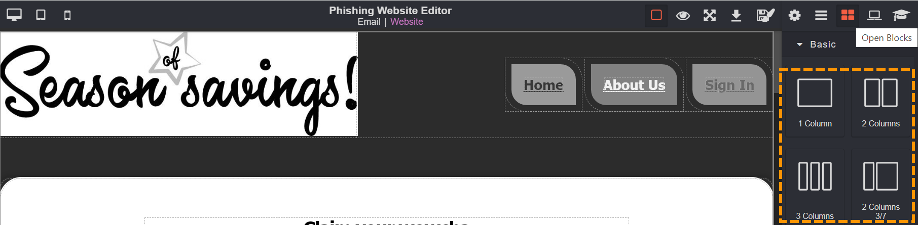
Column
A column helps to give the page structure and it allows you to arrange other blocks into the columns.
Please note that without a column you won't be able to add buttons, spacers, images, or even text.
Text
The text block can be used to add written words to make the phishing email or website more believable.
The text icon can used as many times as you would like throughout the email or website.
Image
Images can be used to create realism, mimic social engineering techniques and to capture the users interest.
An image can be used in both the email and website editor. The image can be in any format (PNG or JPEG) however, they must be below 2MB in size and have fewer than 2 million pixels.
Please note that we do not allow the use of personal images or logos that represent a real company.
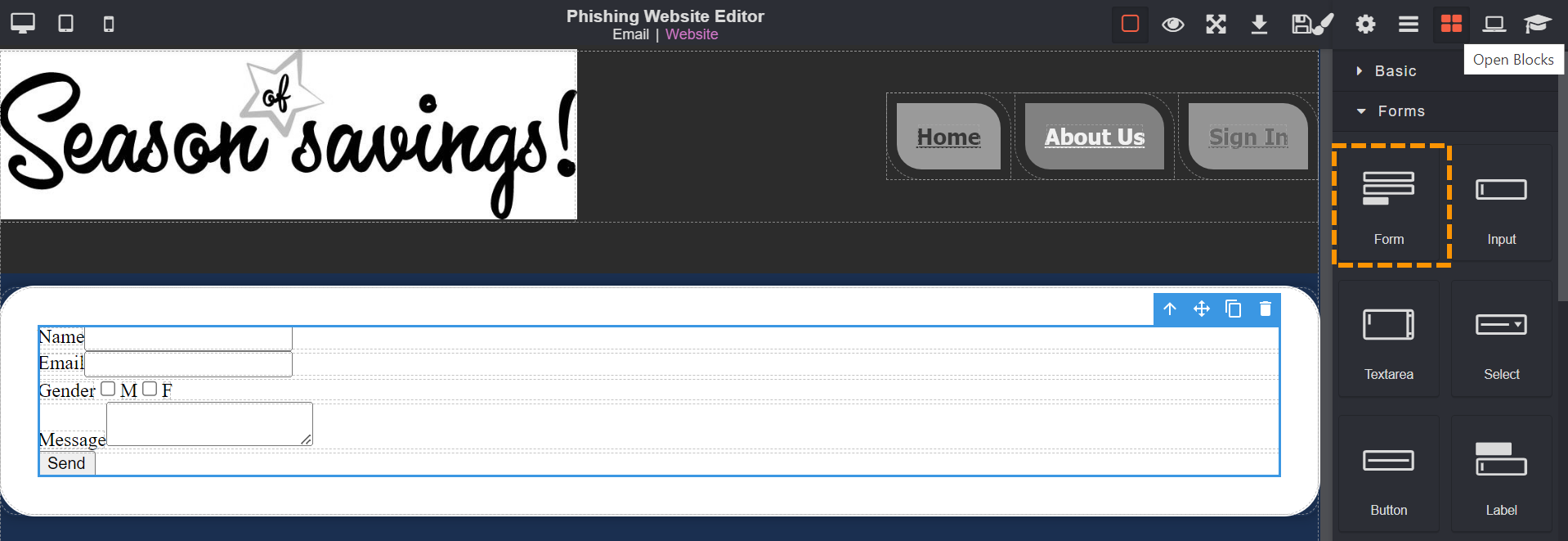
Form
Forms can be used to capture the users details. The form can ask for information such as a name, email, contact number or anything which may get the user to enter their personal details.
Once the user has entered their personal details into the form, they will automatically get taken to the training page to be shown the indicators they should look out for to prevent being phished.
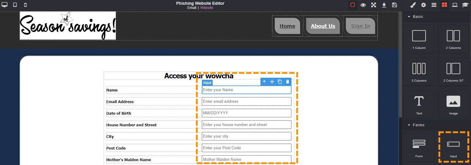
Input
When the input block is present on the page, it can be used to gather details or to get a user to enter their personal details.
Just like the form above, an input is a single line text block.
Once a user has interacted with that input box, they will automatically be taken to the training page.
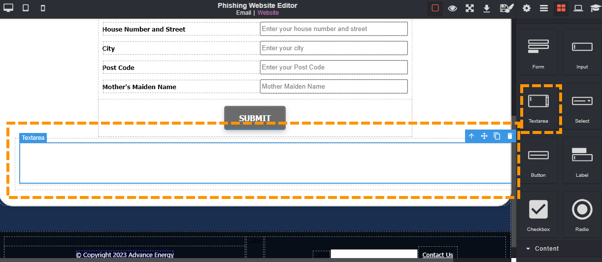
Textarea
The textarea can be used to get users to input or edit multiple lines of text. Textarea is different to the the input block as the text area provides a larger space where a user can type.
When the textarea is used in the phishing website, once the user goes to input any text they will automatically get taken to the training page.
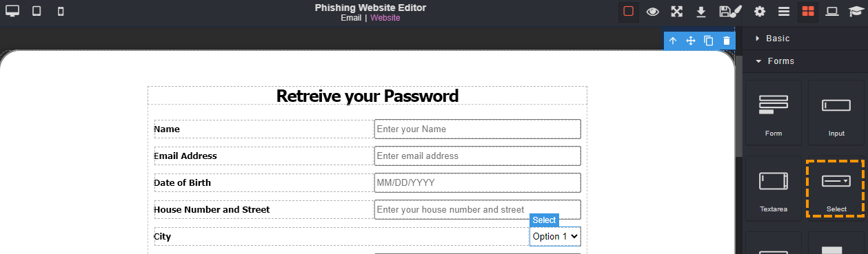
Select
The select block presents you with a list of selectable options. With the drop down menu, it will allow users to scroll through the list of options and select one option from the list.
When a user interacts with the drop down menu, their option will be selected. It's not until the user submits their answer will they be phished and taken to the training page.
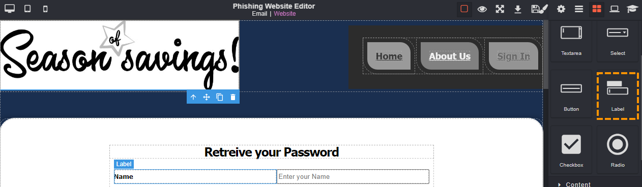
Label
A label is used to provide descriptive text for other elements such as buttons, radio buttons, sliders, input fields and drop down menus.
Labels will help the user to understand the purpose or function of the other element it is associated with.
For example, you could use the label to say "first name" which points out to the user to enter their name.
Once the user has interacted with the website, they will automatically be taken to the training page.
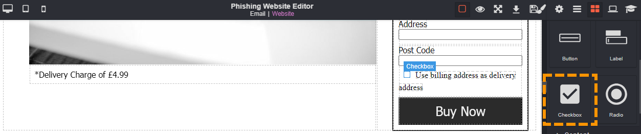
Checkbox
A checkbox can be used to allow users to make selections, indicate their preferences or choose multiple options from a list.
The checkbox will have a small square box that users can click into or tap to toggle between checked (selected) and unchecked (deselected).
When a user clicks the checkbox only, they will not be taken to the training page as they have not entered any sensitive information to trigger the training.
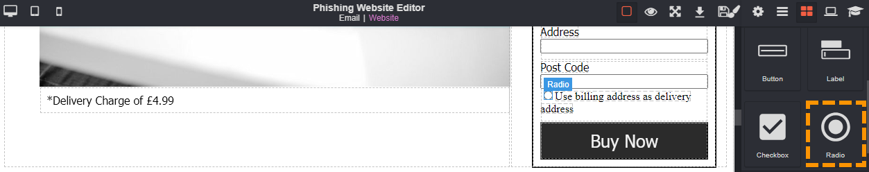
Radio
The radio button is similar to the checkbox but the difference is that the radio is a circular shape rather than a square and also that the user can only select a single option.
The radio button option can be selected by clicking or tapping on the button.
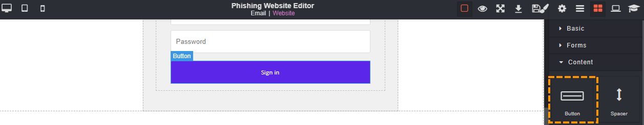
Button
A button can be used to create a user-friendly way of getting a user to interact with the email or website. It can be used to get the user to "submit" their personal details, or to "download" a software update.
When a button is used in the website, once a user has interacted with the button by clicking it, they will automatically be taken to the training page.
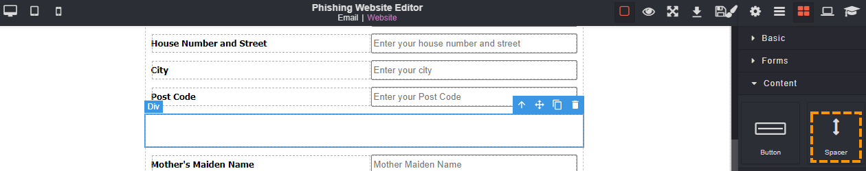
Spacer
A spacer is used in the website to create space, distance or separation between other elements in the website.
Spacers help with the alignment, aesthetics, accessibility and user experience of the website.
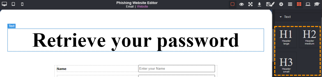
Headings
Headings are important within phishing templates as the different size fonts can be used to maximise the chances of phishing your user. They can be used to highlight important information in the website or to entice the user to click or believe what the website is showing them.
H1 is the primary heading or the main title heading in the website. H1 is the largest text font that you can get from the headings.
H2 is the secondary heading or subheading that can be used in the website. H2 headings help to organise, break down information and guide users through the webpage.
H3 is a tertiary heading within the webpage and it follows after H1 and H2 headings. H3 can be used to further segment the context in the webpage.
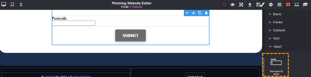
Text Input & Label
The text input & label box comes as a blank box.
The label can be used to provide context, instructions or descriptions about the type of information to input into the associated text box.
This can be used to create a form in the webpage. When a user starts to input information in the text box then they will automatically be sent to the training page.
Navbar
The navigation bar or Navbar can be used to replicate the look and feel of a real webpage. It appears as a menu that users can navigate through by clicking on different sections of the navbar.
The Navbar would normally appear towards the top of the website or along the side depending on how you plan to create the template.
Enjoyed using our product?
Help us out by leaving a review for on Gartner Peer Insights!
It only takes 5 minutes of your time and every review helps us immensely to reach new clients. Thank you so much.